How to add Upvote buttons for your Nextra documentation website
Introduction
This is a step by step guide to integrate Feelback with your Nextra website. This tutorial assumes you’re using the builtin Nextra theme: nextra-theme-docs. However, every Nextra website can be used.
With this guide you will add the Is your page useful widget with upvote buttons to your documentation pages.

In this tutorial you will:
- setup a Feelback project to receive YesNo signals
- install the @feelback/react package into your Nextra website
- add the Like component on your documentation website
- (optional) customize the component style
Step 1: Setup the Feelback project
If you don't have already a Feelback account, please signup and create one. It's free and doesn't require a credit card to use.
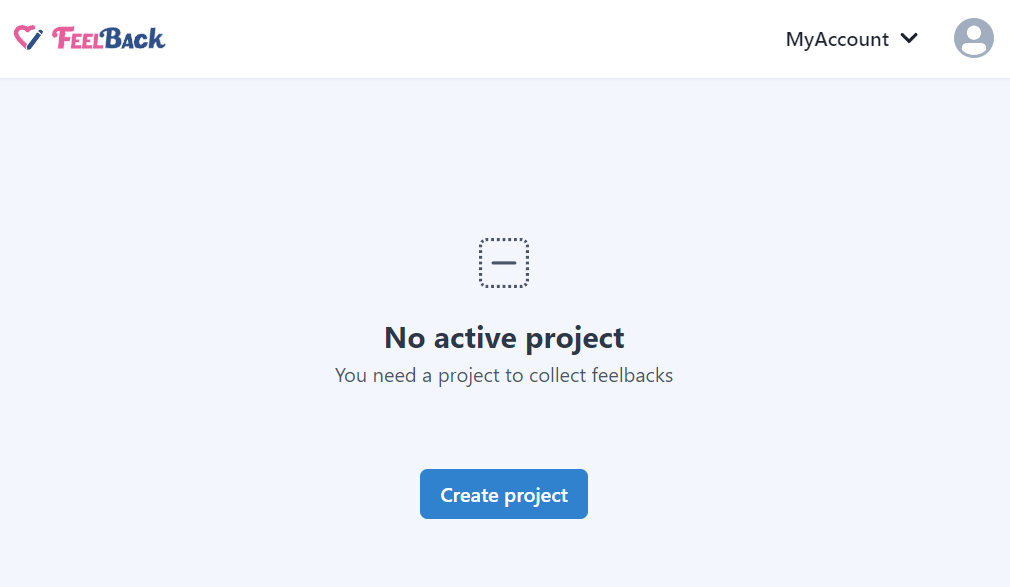
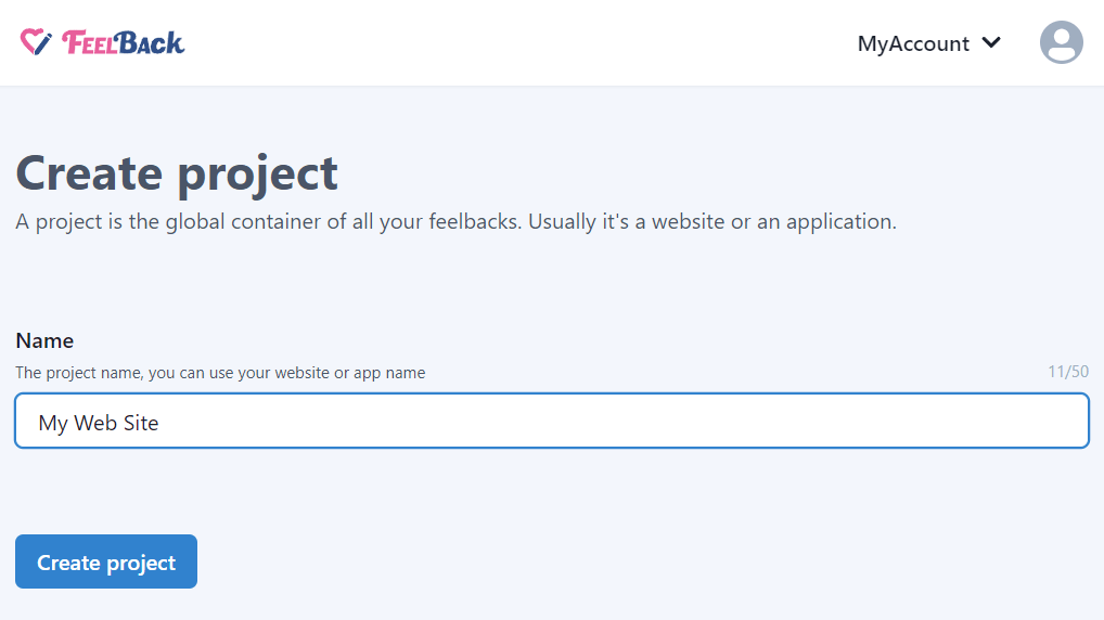
Access the Feelback panel, and create a project if you don't have any.
You can use your website name.
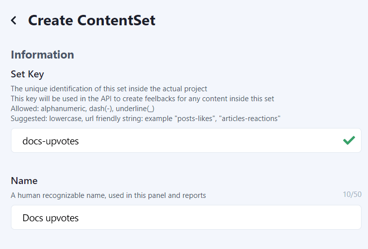
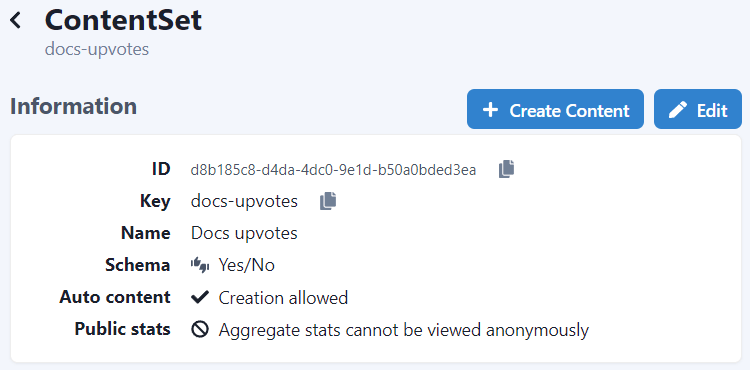
After that, create a ContentSet which will contain your content and feedbacks you will receive.
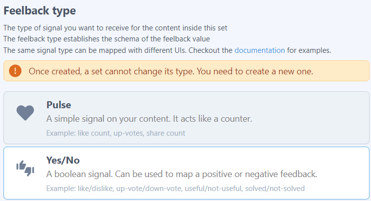
Pick the YesNo type to enable this content-set to receive Upvote signals.
You will end up with a ContentSet like the following one:
Step 2: Install the Feelback plugin
In your Nextra project directory, just install the @feelback/react package:
npm install @feelback/reactpnpm add @feelback/reactyarn add @feelback/reactStep 3: Add the FeelbackYesNo component to the layout page
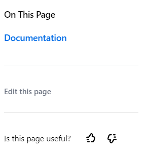
Now you are ready to add the Is this page useful? widget with upvote buttons. Let’s suppose you want the widget at the bottom of your sidebar.
To edit the docs theme nextra-theme-docs, in Nextra you should modify theme.config.tsx file. We can yse the toc extension point to display the feedback form:
theme.config.tsx
import { DocsThemeConfig } from "nextra-theme-docs";

// import the components
import { FeelbackYesNo, PRESET_LIKE_DISLIKE } from "@feelback/react";
// include the default style
import "@feelback/react/styles/feelback.css";


export default {
    logo: <span>My Nextra Documentation</span>,
    project: { link: "https://www.feelback.dev/docs" },
    feedback: { content: null },
    toc: {
        extraContent: () =>
            <>
                <hr className="divider" />
                <FeelbackYesNo contentSetId="your-content-set-id"
                    preset={PRESET_LIKE_DISLIKE}
                    textQuestion="Is this page useful?"
                />
            </>
    },
} as DocsThemeConfig
The result should be something like this:
Additional documentation with all properties and customization you can use is available inside the dedicated React integration guide for each Feelback components.
Step 4: (Optional) Customize the component style
You can override the predefined style with additional CSS.
For example, you can add some selector to change the button icons size and set some custom value.
custom.css
.feelback-yesno .feelback-q {
    font-size: 0.9em;
    padding: 0;
}

.feelback-yesno svg {
    width: 16px;
    height: 16px;
}

.divider {
    margin-top: 1rem;
    height: 0.5px;
    width: 100%;
    border: 1px solid #eee;
}
Full documentation with advanced customization is available inside the React integration guide.
Contributing
The @feelback/react package is open source and available on github. Any contribution is much appreciated. Issues, bug reports and feature requests are welcome. Do not hesitate to reach us or ask for help.
Additional resources
Other guides for Nextra
- How to add an evaluation form for your Nextra documentation articles
- How to add a Send Feedback button for your Nextra website
- How to add a Stripe-like feedback system on your Nextra documentation website
Documentation
- Read the concept guide with an overview of the Feelback service and all the features available
- Checkout the Feelback types list with all signals you can receive from your user, from simple reactions or ratings to more complex error reporting or suggestion messages