Astro Integration
Getting started
The Feelback integration for Astro allows your user to send feedback on your content.
The integration library provides:
- Builtin components with presets ready to use in your pages
- A javascript Client for easy interaction with the Feelback API, useful for building custom components
- Optional styling you can adopt for nice-looking components with no effort
Prerequisite
- node 16+
- astro 1.9+
Setup
You can install the library with your preferred package manager:
npm install astro-feelbackpnpm add astro-feelbackyarn add astro-feelbackYou can include the default style:
layout.astro
---
import "astro-feedback/styles/feelback.css";
---

<html>
    ...
</html>
Step by step guides
You can checkout full tutorials with a step-by-step coverage on how to integrate Feelback into your Astro website.
- How to add a Like button for your blog posts on your Astro website
- How to add a Stripe-like feedback system on your Astro website
Project example
Checkout the sample project astro-docs for a concrete Feelback integration and several usage examples.
Target content
For each Feelback* component you need to set the target content, that is, the content that will receive the feelback. You can do either:
- set the pair
contentSetId/keyproperties: for the auto target - set the
contentIdproperty: for pre-existing global id identification
For more info about how to identify the target content, checkout guide how to set the target content.
Properties
| property | type | default | description |
|---|---|---|---|
| contentId | string | required | specify the target content of the feelback |
| property | type | default | description |
|---|---|---|---|
| contentSetId | string | required | specify the content-set container of the content receiving the feelback |
| key | string | currentURL | specify the content key (unique inside the set), if omitted, it will default to the current page URL |
Value Definition
When using custom elements, here’s the definition for each one:
ValueDef properties
| property | type | default | description |
|---|---|---|---|
| value | string | required | the value to be used and sent |
| title | string | required | the the display text shown to the user for the choice item |
| description | string | undefined | display a subtitle to the choice item, if empty, it will display nothing |
| icon | string | undefined | can be html or a string |
Components
FeelbackPulse
Display an icon button allowing users to activate it. Used to receive a Pulse feelback on your content.
Optionally, you can show a counter, which tracks the total amount of pulses received for the current content.
Properties
| property | type | default | description |
|---|---|---|---|
| target | TargetContent | required | specify the target content |
| preset | Preset | ValueDef | "heart" | determine which icon to display, you can pass a preset (see the list below) or use a custom one |
| showCount | boolean | false | show the total pulses for the content |
Presets
The FeelbackPulse component supports the following presets:
| preset | description |
|---|---|
heart | display a heart icon which fills when active |
star | display a star icon which fills when active |
like | display a like icon which fills when active |
Example
BlogPostTitle.astro
---
import FeelbackPulse from "astro-feelback/components/FeelbackPulse.astro";
interface Props = {
title: string
}
const { title } = Astro.props;
---
<div>
<h1>{title}</h1>
<FeelbackPulse contentSetId="content-set-id-from-panel"
preset="heart"
showCount
/>
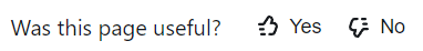
</div>FeelbackYesNo
Display an small control with an optional question text with to icon buttons, for Ys and Ns. Used to receive a YesNo feelback on your content.
Optionally, you can show a counter near each button with the total of Ys and Ns for the current content.
Properties
| property | type | default | description |
|---|---|---|---|
| target | TargetContent | required | specify the target content |
| preset | Preset | ValueDef[] | "like-dislike" | determine which icon to display, you can pass a preset (see the list below) or use a custom one |
| showCount | boolean | false | show the total count of Ys and Ns |
| showTitle | boolean | true | display the browser builtin tooltip on button hover |
| textQuestion | string | "Is this page useful?" | you can set this to empty or undefined to hide the text |
| textAnswer | string | "Thanks for your feedback" | shows this text after the user pressed one of the buttons |
Presets
The FeelbackYesNo component supports the following presets:
| preset | description |
|---|---|
like-dislike | display the pair thumb-up and thumb-down icons |
check | display the pair check (tick) and times (X) icons |
arrows | display the pair up-vote and down-vote icons |
Example
BlogPostTitle.astro
---
import FeelbackYesNo from "astro-feelback/components/FeelbackYesNo.astro";

interface Props = {
    title: string
}

const { title } = Astro.props;
---

<div>
    <h1>{title}</h1>
    <FeelbackYesNo contentSetId="content-set-id-from-panel"
        preset="like-dislike"
        textQuestion="Do you like this page?"
        textAnswer="Thanks for your feedback"
    />
</div>
FeelbackReaction
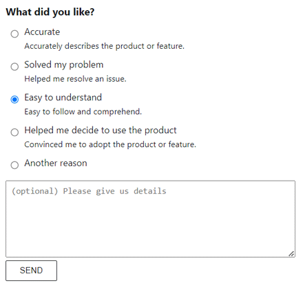
Display a control which allows the user to pick an emoji reaction. You can receive a FeelbackReaction feelback on your content.
This component supports both a picker layout, where a Select Reaction button is displayed, or list layout, where all emoji are displayed directly.
Properties
| property | type | default | description |
|---|---|---|---|
| target | TargetContent | required | specify the target content |
| preset | Preset | ValueDef[] | required | determine which icon to display, you can pass a preset (see the list below) or use a custom one |
| layout | "picker" | "list" | "list" | set the component layout:"picker" 🡒 display a Pick Reaction button, when pressed a little popup shows all reaction the user can pick"list" 🡒 display all emoji in a row |
| showCount | boolean | false | show the count for each reaction near the relative icon |
| showTitle | boolean | true | display the browser builtin tooltip on button hover |
| textQuestion | string | "Is this page useful?" | you can set this to empty or undefined to hide the text |
| textAnswer | string | "Thanks for your feedback" | shows this text after the user pressed one of the buttons |
Presets
The FeelbackReaction component supports the following presets:
| preset | description |
|---|---|
feeling | display three feeling emoji faces: happy, neutral, sad |
github | display the github builtin emoji |
facebook | display the facebook builtin emoji |
Example
BlogPostTitle.astro
---
import FeelbackReaction from "astro-feelback/components/FeelbackReaction.astro";
interface Props = {
title: string
}
const { title } = Astro.props;
---
<div>
<h1>{title}</h1>
<FeelbackReaction contentSetId="content-set-id-from-panel"
layout="picker"
preset="github"
showCount
/>
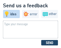
</div>FeelbackTaggedMessage
Display an form with a button choice and an optional text message. You can receive a FeelbackTaggedMessage feelback on your content. The user can pick a button to activate the relative tag, and optionally can fill a textarea before sending the feedback.
This component supports different layouts:
- inline, the form is directly displayed
- reveal, the tags are displayed as buttons and when pressed the text area appears
- radio group, the tags are displayed as radio
- button-based, where a
Send Feedbackbutton is displayed that, when pressed, shows the form


Properties
| property | type | default | description |
|---|---|---|---|
| target | TargetContent | required | specify the target content |
| preset | Preset | ValueDef[] | required | determine which icon to display, you can pass a preset (see the list below) or use a custom one |
| layout | "inline" |"reveal-message" |"radio-group" |"button-switch" |"button-dialog" | "inline" | set the component layout:"inline" 🡒 display the form directly"reveal-message" 🡒 display the tags as icon buttons, when pressed the message area appears"button-switch" 🡒 display a button, when pressed disappears and shows the form"button-dialog" 🡒 display a button, then pressed shows a blocking centered dialog |
| title | string | "Send feedback" | The form form title |
| label | string | "Send feedback" | The button label for button-based layouts |
| textAnswer | string | "Thanks for your feedback" | shows this text after the user pressed one of the buttons |
| placeholder | string | "Type your message" | the text message placeholder |
| showLabels | boolean | false | true to the tag-button labels otherwise only the icon will be visible |
| preselect | string | number | undefined | tag to preselect, if specified as string the tag with that value is preselect, if number the tag at that position |
| withEmail | boolean | "required" | false | show an email field, optional to fill. if "required", the field must be filled |
Presets
The FeelbackTaggedMessage component supports the following presets:
| preset | description |
|---|---|
like-dislike | display the pair thumb-up and thumb-down icons |
feeling | display three feeling emoji faces: happy, neutral, sad |
evaluation | display four feeling emoji faces: love, happy, sad, cry |
feedback | display three feedback-type icon: idea, error, other |
Example
Rightbar.astro
---
import FeelbackTaggedMessage from "astro-feelback/components/FeelbackTaggedMessage.astro";
---
<div class="rightbar">
<FeelbackTaggedMessage contentSetId="content-set-id-from-panel"
layout="button-switch"
preset="feeling"
label="Send feedback"
title="What's on your mind?"
textAnswer="Thanks for your feedback"
/>
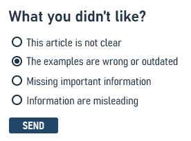
</div>FeelbackSplitTaggedMessage
Displays a Do you like this page? question with Yes / No buttons. When pressed, a form with different choices is shown. The user can pick a choice to activate the relative tag, and optionally can fill a textarea before sending the feedback. The choices can be different for the Yes and the No cases.
You can checkout a step by step guide to use this component: Stripe-like documentation for Astro.
With the FeelbackSplitTaggedMessage, you can receive a FeelbackTaggedMessage feelback on your content.
Properties
| property | type | default | description |
|---|---|---|---|
| target | TargetContent | required | specify the target content |
| titles | { y: n: string} | (empty) | The form form titles for both the Yes case and the No case, if empty the title is not shown |
| tags | {y: ValueDef[], n: ValueDef[]} | required | The list of ValueDef values for both the Yes case and the No case, used to compose the choices |
| textQuestion | string | "Is this page useful?" | you can set this to empty or undefined to hide the text |
| textAnswer | string | "Thanks for your feedback" | shows this text after the user pressed one of the buttons |
| placeholder | string | "Type your message" | the text message placeholder |
| withMessage | boolean | false | show an textarea for an optional text message |
| withEmail | boolean | "required" | false | show an email field, optional to fill. if "required", the field must be filled |
Example
ArticleFooter.astro
---
import FeelbackSplitTaggedMessage from "astro-feelback/components/FeelbackSplitTaggedMessage.astro";

const YES_TAGS = [
    {value: "love", title: "I love this"}
    {value: "moderate", title: "I like this"}
];
const NO_TAGS = [
    {value: "dislike", title: "I don't like this"}
    {value: "hate", title: "I hate this"}
];
---

<div class="footer">
    <FeelbackSplitTaggedMessage contentSetId="content-set-id-from-panel"
        tags={{y: YES_TAGS, n: NO_TAGS }}
        titles={{ y: "How much do you like?", n: "How much you didn't like?"}}
        textAnswer="Thanks for your feedback"
        withMessage
    />
</div>
Style
Feelback components can use the default style provided by the package.
You can import directly the css in your layout file:
layout.astro
---
import "astro-feelback/styles/feelback.css";
---
Or, if you use sass, you can include the source scss and override theme variables:
style.scss
@import "~astro-feelback/styles/feelback.scss";